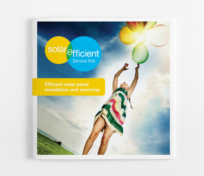
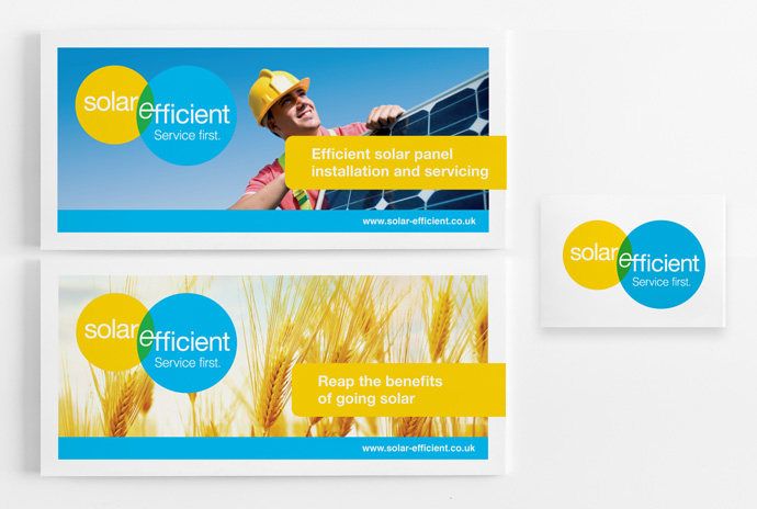
The brief, was to generate a brand name, identity, marketing collateral and website ready for the launch of the company.
In the planning stage, we found that this market was saturated with companies focussed on products. The client already has a strength for customer service, so this became the main focus of the proposition. "We offer the best service in the area."
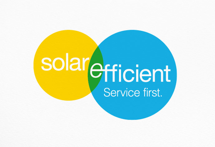
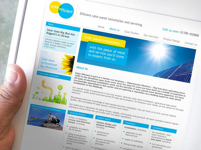
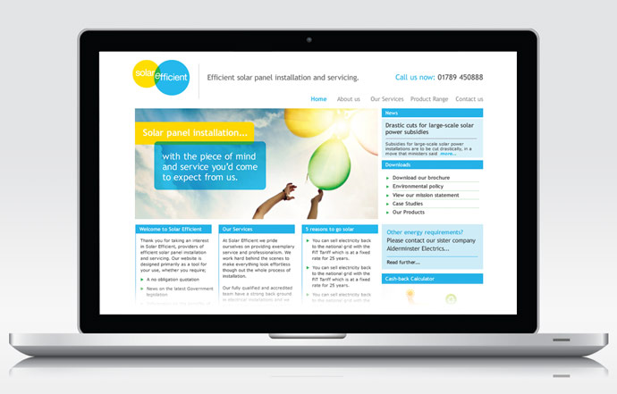
The direction was simple – create a service orientated brand identity to stand out from the crowd and play to our client’s strengths. This route led to the development of the Solar Efficient brand. By using evocative, aspirational imagery, we opened up the concept to appeal to these very different audiences while staying true to the core message of “Service First.”
The concept for the branding is as follows: Yellow represents the sun, blue represents electricity and green where they meet, represents renewable energy. The fresh, vibrant colours and clean layout offer a very different aesthetic approach to the more cluttered competitors.
Overall, over 50% of website traffic is new visitors and as a result of press advertising, DM and word-of-mouth – over 70% of traffic comes direct to the website, as opposed to search engine links.